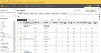
Bing Ads is getting a new interface today, as per last week’s announcement, but the roll out may take a few weeks.
The new interface will help clear the cluster of the previous version and will be less visually taxing, as Microsoft has cut down on some of the colors crowded in the format and increased the canvas altogether.
The whole idea behind the change is to make data visualization more efficient and to better help customers.
Search Engine Land reports that Jamie Chung, Product Manager with the Bing Ads UI, has said that the new look is the result of a process that was recently adopted by the engineering team, which starts a project based on users’ opinions, rather than build a design and get feedback later.
This does not mean that there won’t be a feedback area. In fact, the new interface will have areas where users will be able to go in order to communicate directly with engineers.
The Accounts & Billing tab will now be found under the gear icon placed in the top right corner, while other features that had been tough to locate in the previous version have been moved in the primary navigation panel.
Microsoft also plans to implement additional changes, which will include more shared libraries.

 14 DAY TRIAL //