Confusing. A pretty familiar term for all those who have already made the move to Windows 8, Microsoft’s latest operating system that has always been criticized for its new user interface.
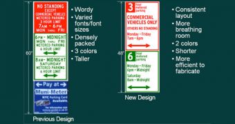
Pentagram Design, the company behind Windows 8’s logo, will have to deal with a confusing job once again, as it has signed a deal with the City of New York to redesign the public parking signs.
It appears that authorities find that all signs take too much to read, so Pentagram Design will reduce the length of the text from 250 characters to only 140.
“The new design also places the day of the regulation before the hours of the regulation, eliminating abbreviations and retaining all necessary parking information while making it easier to read,” the City of New York said in a press release.
A total of 6,300 parking signs will be replaced in the first stage of the project, as local authorities want to get rid of those using different colors, typefaces, font sizes and confusing text.

 14 DAY TRIAL //