14 DAY TRIAL //
 Most application launchers out there are designed to be small and fast, and work like a search engine. This quick, efficient, keyboard centric type of application is widely appreciated and has quickly become the norm. However, despite how many people like a certain thing and use it, there will always be other who don't like it and would prefer something else. Unfortunately, when it comes to non-keyboard launchers, choices are limited, and there are quite a few duds out there with such a horrid interface that you would be better of using the Finder. Luckily, Valet isn't one of them.
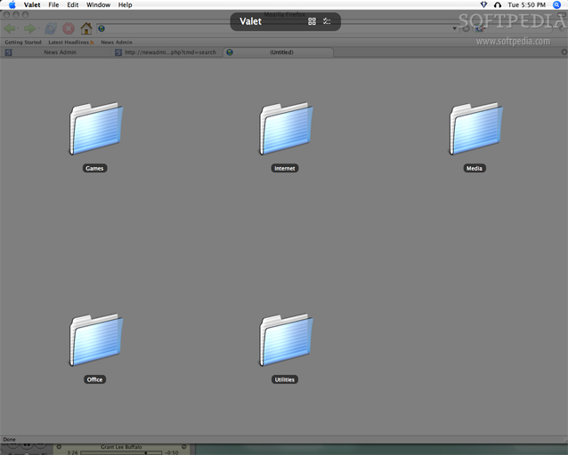
What it does Valet is an application designed to help you quickly access your programs, files and folders. Unlike most such applications, it does this without the keyboard, using a large icon-based display, without making use of any search engine like functionality.
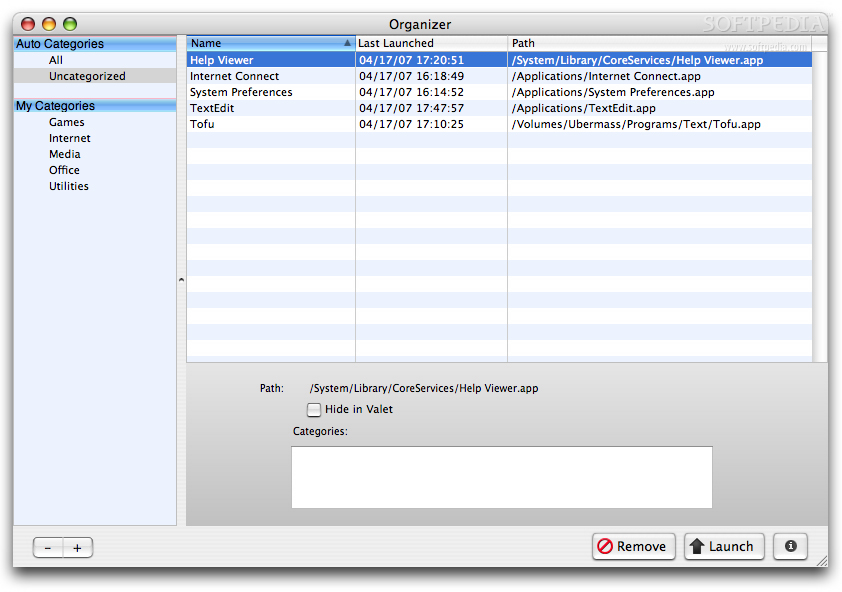
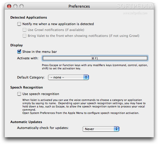
Working with it Like all launchers, Valet is quite useless without a number of things to launch. To set up the program for this purpose, you can either manually add the items you need or simply let the program learn them as it goes. Whenever you start the program up, it monitors all running applications, and, if it comes across one that it does not know, it will ask what to do about it. These notifications can be easily disabled if they become annoying, since the programs will be added to Valet's 'Uncategorized' regardless, and you can come back to them at any later date.
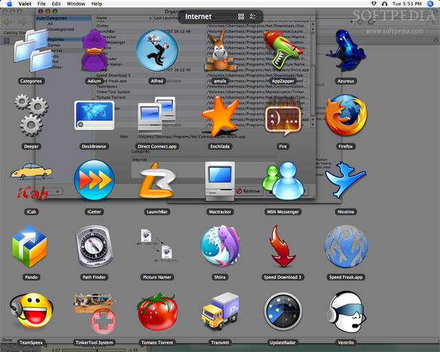
Unlike search based launchers, Valet works with icons and folders. Whenever you bring up its display, you will be greeted by the folders of the main categories. Selecting any of them will show you the contents of that, category, which can be files, applications and even other folders. In this respect it works much like the Finder. The icon display will automatically resize the icons so that they always fit on screen, regardless of how many there are, but looks the best by far when it can make use of the large 128x128 OS X icons.
Navigating Valet's head-up display can be done with either mouse, keyboard or voice. When using the arrow keys, the keyboard navigation can get quirky at times, and, despite the fact that you can start typing the name of an item to jump to it, is slow overall. Using your voice to launch items is very quick, mainly because you can launch anything from anywhere. You don't have to be in the category there the application is located, and there is nothing to prevent you from launching several applications while you are using your mouse to launch the files you will be working on. Using the mouse is like using the mouse. The only difference here is the Valet MenuBar item, which presents all of the Valet contents as a hierarchical menu.
Icon woes One of the better things about Valet is that the heads-up display makes use of the entire screen, and the big icons that give it that certain feel. Unfortunately, there are some issues that can appear, depending on how many items you have in a category. Firstly, with certain icon sizes, you get a rather nasty looking empty space on the right side, which is strange since when there are only a few icons, the application simply centers them. Why the centering does not get applied is a mystery. Secondly, sometimes you get a couple of icons that are mostly off the screen. This is bad not only because it looks horrid, but also because more often than not you cannot tell what that item is, unless it has a very distinctive icon. The only thing that can make this problem go away is having fewer or more items in the category, which is a major pain. To make matters worse, when you do get off-screen icons, it also messes up the keyboard arrow navigation. Left and right work fine, but up and down move you diagonally across the lines. It is mind boggling to navigate and you quickly stop trying to use the keyboard altogether.
Last but not least, as good as those big application icons look, the categories screen is simply horrible to look at because of all the identical icons. In a visual based navigation mode, having so many identical icons is as close as you can get to being lost. The text you have to read to navigate these looks very small, compared to the icons, and feels hard to read. What is missing here is the ability to set custom icons for all those categories, as well as some options so we can change the opacity of the screen overlay, the color and the text size.
The Good
Makes good use of the entire screen and flashes out those large, good looking OS X icons. The voice activation is also very nice.
The Bad
Has several issues regarding icon size and placement, as well as keyboard navigation. Some customization options for the visual aspect of the program are also needed.
The Truth
Valet does not try to mix in any functionality from other, text based, launchers so it looks good and works well overall. It just needs a little more polish and to loose those bugs and it will make many visually orientated, mouse loving users happy.
Here are some screenshots, click to enlarge: