14 DAY TRIAL //
 There is always something to be said about wanting to know what is going on with our computer. We are always receiving information about the current state of our body, which is being processed all the time, and in a similar way, some of us need to know what is happening to our computer. It's not just about wanting to see what the processor load is when applications start to lag, and what the memory consumption is and how much you have free when working with large files, but rather having constant feedback at all times, not just the extreme situations. There's a lot of programs that do this out there, each with their own pros and cons, and System Manager is no different.
The information provided by System Manager is split up into four main categories, and we will be discussing them in turn.
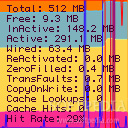
Memory The memory display shows a visual representation of the free, active, inactive and wired memory. Beside the graph, the exact values are also displayed in numbers, representing exactly how many megabytes of RAM are allocated to each category. Beside the current status of the memory, page-ins and page-outs are also displayed in an overlay.
The wired memory is reserved for the core system resources and is pretty much set in place. Active memory is memory in which information is currently being stored and used while inactive memory is where information was stored, but is not currently being used. The information in the active memory can go to inactive memory, a trip that goes both ways, while the free memory currently contains no information and can be filled up at any moment. Pageins and pageouts represent the reading and writing of memory to the hard drive, and frequent occurrences of this are a clear indicator that you could use some more RAM.
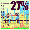
CPU load The CPU display shows the current state of the processor. The system and user load as well as the nice and free percentages are showed both in numbers and in a visual representation using a graph. The display has a big bold indicator for overall processor load on the top of it, with the individual values below.
A nice touch is that the program gives this display a colored border, depending on how strained your processor is, using one of three colors. Also, if it is supported, the program will display the temperature of your processor here.
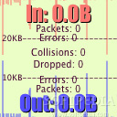
Network This display will show the activity of the network interface of your choice. Two big bold text indicators show the current inbound and outbound throughput and then, for each of the two directions you have text indicators for the number of errors and packets currently detected. In the middle, between the two, the number of collisions and packets dropped can be seen.
The display also shows the throughput in a visual manner using a graphical representation.
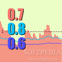
System Load This display will show the overall system load over the past 5, 30 and 60 seconds. In the usual manner, the display contains both a graphical representation of the load and a numeric display.
Balancing it all out The System Manager displays are configured by default to take up a 128 pixel square each. They are huge, to say the least, and there are four of them. While the program does let you shrink them, you are left with the problem of the text, which becomes totally illegible even at 80 pixels square. You need to keep them at the default size to be able to get any use out of the displays.
In contrast, other applications such as iPulse display all the base information offered by System Manager and more, all in one single convenient and easy to read 128 pixel square display. The additional information can be obtained through floating windows when you hover the mouse over each gauge, and it is a lot more information than System Manager offers.
In terms of screen real estate, System Manager simply demands too much for you to be able to keep it open all the time and make proper use of it.
The Good The modular design gives you the possibility to keep only the displays you want, and the way it can display that in the dock icon makes it even easier to use one of the displays.
The Bad To make the most out of this program you have to give up too much of your screen. The displays are totally illegible at smaller sizes and there a four of them in all. Granted, you only really need the base three, but that is still a lot of space.
The Truth If you need big displays to show you what is going on with your computer, then go for this program, if you need something that is space-efficient, you are going to prefer iPulse.
Here are some screenshots, click to enlarge: