14 DAY TRIAL //
 I have never been a great fan of widgets. Sure, they are great for all kinds of things and, in general, if you want a small program that does a very specific something, a widget is the way to go. However, since nearly all widgets are not designed to be screen efficient and many are very limited indeed in scope, you either have ones that are too big for no reason other than to look good, or end up using two to get the functionality of one. Then there is the fact that I like something I can have in my field of view at all times, and the Dashboard just doesn't cut it for me. For the aforementioned reasons, I have never found a system monitoring widget to please me, and I am a great believer in these programs. iPulse has always done right by me, but it can be intrusive at times, and there is no way to minimize it, so I took a look at X Resource Graph, and had quite a nice surprise.
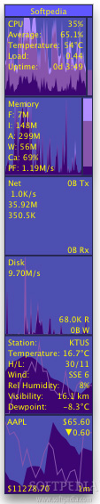
What it does X Resource Graph is a system monitor, a small program that gives you all the information you need on the current status of your system.
Inside its minimalist interface, the program shows the status of the CPU, system memory, network traffic, disk transfers, battery status, temperature (both inside the computer and outside your house), as well as the current situation of any stock of your choosing.
Large but small Unlike iPulse, which uses a 128x128 pixel display to show you everything, X Resource Graph has many different 'graphs' each in its own separated space, which you can hide or show. While expanded, it takes up a lot more space than iPulse to display all the information, however, unlike iPulse, it can be set to minimize, collapsing onto itself until only the title bar is left, and then expanding when you move mouse over it. This gives X Resource Graph the advantage of being incredibly unobtrusive until you need it, unlike iPulse that is always there, and cannot be minimized or hidden quickly.
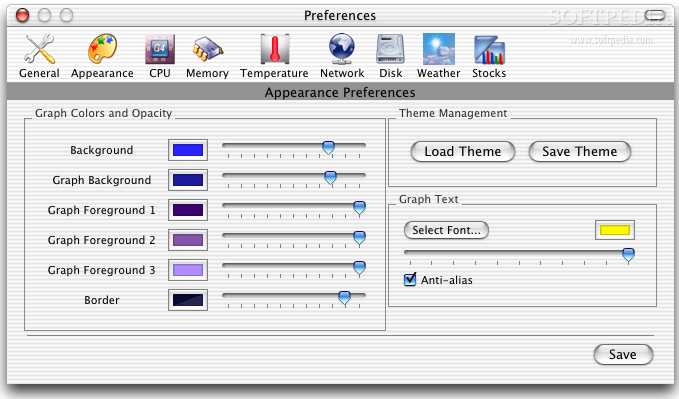
The minimizing can be set to automatic when you place the mouse over the title bar, or it can be manual, when you double click on it. Furthermore, the graphs can be stacked vertically or horizontally, and the minimization can make it collapse either up or down or left or right, letting you place the program anywhere on screen and have it behave as expected.
Graphs or gauges After years of using iPulse I am used to the gauges, and find the graphs a lot harder to read at a glance, especially since there are a lot more numbers on them. That having been said, the graphs do indeed give a much better view of the computer as they show the state over quite a period of time, and not just the current one.
However, unlike other graph displays, X Resource Graph also has a very nice gauge like indicator, even if it is only available for CPU and Memory, which makes it a bit of the best of both worlds in this respect.
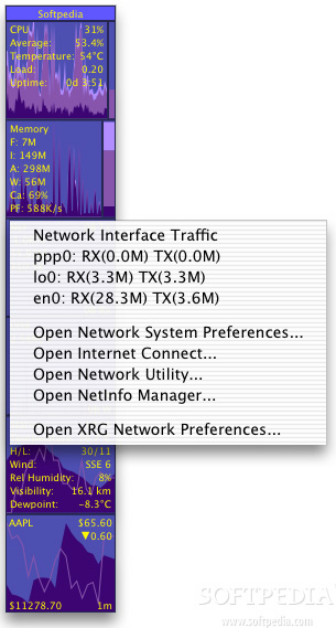
In addition to the graphs themselves, most of the information is also presented as text, overlaid on the graphs, and you can choose where or not to display a lot of it. Another thing the program can do is provide additional information through contextual menus. Simply right click on any graph, and a contextual menu will appear with additional information that is related to the graph you clicked on. In this respect, iPulse is the better source of information with a lot more to tell you than this program whose information most of the time mirrors that found in the display of the graph itself.
Eye candy This is a delicate issue since tastes differ greatly from person to person. However, it is important to note that while X Resource Graph is not bad looking, it offers very limited options when it comes to color coding each element. Basically, all you can set is the background color, the graph background color, three graph colors to be used in the graphs themselves and the color of the border. While this gives the entire program a consistent, pleasing look, I have to go with iPulse in this respect, which lets you assign a different color to each element. At the end of the day, despite having a consistent look, this only serves to make it much harder to tell anything at a glance.
The Good Much less intrusive than iPluse, can be hidden and shown at will. Provides better over time information because of the graph approach.
The Bad Not very customizable, harder to read things at a glance. Also shows a lot less information than iPulse, both in information per pixel and extra information windows.
The Truth One of the best 'graph' system monitors I have seen. The fact that it is unobtrusive is its greatest advantage, however, when it comes to sheer information, iPulse outdoes it in every way.
Here are some screenshots, click to enlarge: