14 DAY TRIAL //
 There are times when you find yourself asking things like: Why is this page taking so long to load... what's my connection's throughput? Just how processor intensive is this program? Why is this so slow, How much free RAM do I have left?
iPulse is a small widget-like program that displays all the system related information you could possibly want in a small, well designed interface.
The iPulse display is a clock-like entity that can exist in the dock, as a floating window, or (with a different layout) in the menu bar. Unlike other system monitoring applications that only display CPU load or network activity, iPulse gives you comprehensive information, although in a rather larger display.
The CPU Gauge At the core of the iPulse is the CPU meter. Here you can see the load of the CPU, or CPUs in case you have a dual or quad processor box. Low priority tasks, user load and system load are all shown with separate colors to make it very easy to differentiate between them. Also, the entire gauge changes tint depending on how busy your system has been over the past 15 minutes. Furthermore, on the outermost ring of iPulse is the load history that shows the load value for every minute over the last hour. Each minute has a dot, the more opaque the dot, the greater the load encountered at that time. If you hover the mouse of the the CPU gauge, a information window will appear, listing the current, minimum, maximum and average load for each processor. You can also see how much of the processing time is dedicated to the system or user and how much is nice or idle, as well as a list of the top ten most processing intensive tasks that you have running.
The first ring around the core CPU gauge is divided into two halves. The bottom one is the Disk gauge and the top one is the Memory gauge.
The Disk Gauge The Disk gauge has two layers, on the first, disk usage is shown. You can choose to display each individual drive or all of them combined. On the second layer you can see disk activity. In the information window that appears on mouse over, you can see the current number of reads and writes, as well as the current, peak and average activity. If at any moment, a drive is more than 90% full, the gauge for that disk will change color to indicate this and warn you. One thing I did notice is that mounted network drives also appear in this gauge which can be a nightmare if you mount many. The gauge never displays mounted disk images so an option to turn off network drives would go a long way.
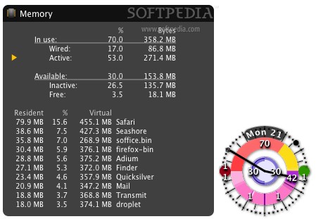
The Memory Gauge The Memory gauge shows you the state of your memory. Memory is divided into two categories, "in use" and "available", each of these is then broken into two sub categories: wired and active; and inactive and free respectively. Wired memory belongs to the core kernel, and is locked in place and active memory is currently being used by the running processes, while inactive memory is not currently being used, and free memory still remains to be used. Holding the mouse over the Memory gauge will display the percentages and values for each type of memory as well as a list of the top ten memory consuming applications.
The second ring circles the previous one and is also divided into two halves; the upper half indicates Memory Swapping, while the bottom half shows Network Activity.
The Memory Swapping Gauge When the system is running short on physical RAM, old information from inactive memory is written to disk to make room for new information (known as a pageout). In the right half of the Memory Swapping gauge, you can see the current number of pageouts. Whenever the system needs something that has been written do disk, it loads that information back into the physical RAM (known as a pagein). Pageins can be seen in the left half of the Memory Swapping gauge.
The Network Activity Gauge Network Activity is probably one of the most often sought pieces of information. The gauge is divided into two halves, the left showing download while the right indicating upload. In the information window we can see the current throughput, the peak and the average values both in bytes and in bits.
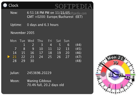
Additionally, iPulse also displays the time, a calendar, uptime, as well as the phase of the moon. That is a great heap of information packed into a 128x128px package. The preferences let you customize every aspect of the gauges and dials and the program has support for "jackets" which are a combination of skins and preferences that change the way iPulse looks.
The Good All the information you could possibly want about your system, beautifully presented and fully customizable.
The Bad Has a bit of a learning curve and all the information might seem overkill to the less technically inclined.
The Truth There are many such programs out there, but iPulse covers an overwhelming amount of information while taking up minimal screen real estate. The jackets and level of customization give you the possibility to tweak it the way you've always wanted and to ensure that it also looks good on your screen.
Here are some screenshots of iPulse in action, click to enlarge: