14 DAY TRIAL //
 Visualisers have never really interested me. This is partly because I am usually doing something while listening to music, and partially because most of them are? bland. The default one in iTunes is pretty uninteresting, other than a few effects that come once every blue moon in its long list of random swirling squiggles, it doesn't really look that good, and it hardly ever matches the music. This is not to say that Apple is particularly crappy at making visualizations, most of the iTunes plugins that add visualizations are guilty of the same sins, but rather that randomly generated pulsing squiggles are not as fascinating today as they might have been when visualizations first came out.
That having been said, I have recently stumbled upon a very nice visualization plugin that is actually more of a visualization engine sort of thing, called iVisualize.
What it does In a nutshell, iVisualize is a visualization plugin that gives you extra visualizations to choose from, as well as configure them.
To those more technologically inclined, it actually acts as an engine for linking Quartz Compositions and letting them function as iTunes visualizations, as well as passing relevant information about the track and music to the composition.
Not your average visualizations The main difference between the iVisualize visualizations and other ones is that the quartz compositions do not rely exclusively on randomly generated visual imagery that runs off some algorithms. Most of it is predefined, and as such quite predictable, most of everything that happens in them being determined by the music that is playing.
Another significant difference is the Quartz Compositions can make good use of 3D elements, and as such, most of the compositions that come with iVisualize are 3D ones.
What this boils down to in terms of the visualizations themselves, is that they are a lot more 'static' in that they lack the ability to be as protean as the 2D algorithm based ones that have tens of possible algorithms. However, this makes them a lot more predictable as you can almost always tell what a visualization will look like, regardless of what you are listening to.
The visualizations themselves The visualizations that come with iVisualize are very nice and varied, and give a very good idea of what the plugin can do using Quartz Compositions.
BeComposed is a very good example. When you turn the visualization on, you see a CD, with the album art printed on it, which slowly begins to spin, and then zooms in to take you into the main visualization, which is a 3D representation of the CD of the album you are currently listening to, using the art present in the tracks to display the album cover. The CD case then turns around to show the information about the currently playing track.
Most of the elements of the visualization can be altered, to suit both taste and computer capabilities, because these visualizations can get very processor intensive with things such as reflections and high definition textures.
iVestream is like older visualizations, in that it is 2D, however, it makes use of particles, which react to the volume and pitch of the music. The two wisps of smoke grow, shrink, dance and frolic on the screen, often passing through each other and merging only to then separate again. Again, all this is actually determined by the music you are listening to, making it a far more immersive experience than the standard visual effects.
Resource Hog Because of the way iVisualize uses Quartz Compositions as visualizations, it takes a lot more processing power than traditional visualizations. This is especially true if you turn on things like reflections and image smoothing. Also important is the size of the visualization. Unlike traditional 2D visualizations that look better the smaller they are, because iVisualize uses 3D elements it looks worse at smaller sizes because of line tearing and other visual artifacts. In effect, if you want it to look best, you need to make it big, which also requires more resources.
The Good Very different visualizations that make use of the Quartz Compositions introduced in Tiger. More in tune with the music that is currently playing, and very distinct visualizations which often contain 3D elements and particles.
The Bad A lot more resource intensive than the traditional visualizations.
The Truth If you are unhappy with the current visualizations and want something different, then give this a look. Definitely not the best choice for older machines, but will perform fine on newer ones.
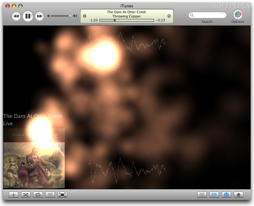
Here are some screenshots, click to enlarge: