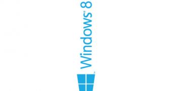
If you thought that the new Mac Pro looks just like a trash can, you probably haven’t had a look at the Windows 8 logo from a different angle.
It turns out, however, that some people already did this, so as you can see in this picture, if you rotate the Windows 8 logo a little bit and add a bit of imagination, it all looks just like a trash bin.
Sure, this photo must be created by a pure Windows 8 hater, but at some level, he must be right, even though we must admit that we never looked at this logo this way.
And still, in some people’s opinion, Microsoft actually got it right with this design, as Windows 8 not only that failed to gain traction, but it actually affected PC sales and made working on a computer pretty confusing for many beginners who were trying to do simple things such as shutting down their devices.

 14 DAY TRIAL //