14 DAY TRIAL //
 Microsoft has just rolled out a new design for its official website, thus switching to a more modern and fresh approach that would get its homepage in line with other products that are getting revamped these days.
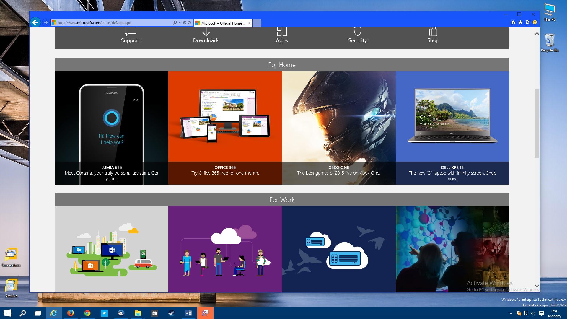
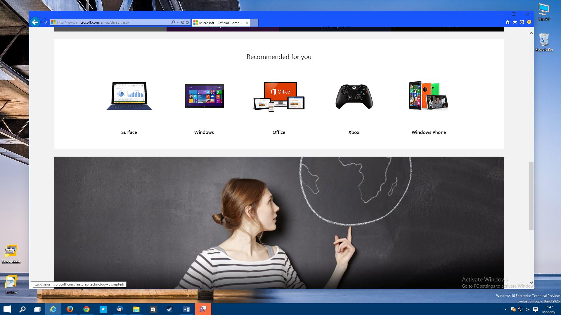
The new website indeed looks really good and is mostly based on large images that put the main products and ideas in the spotlight, while the icons used on the website follow the same concept as in Windows 10 and rely on a much simpler and minimal approach.
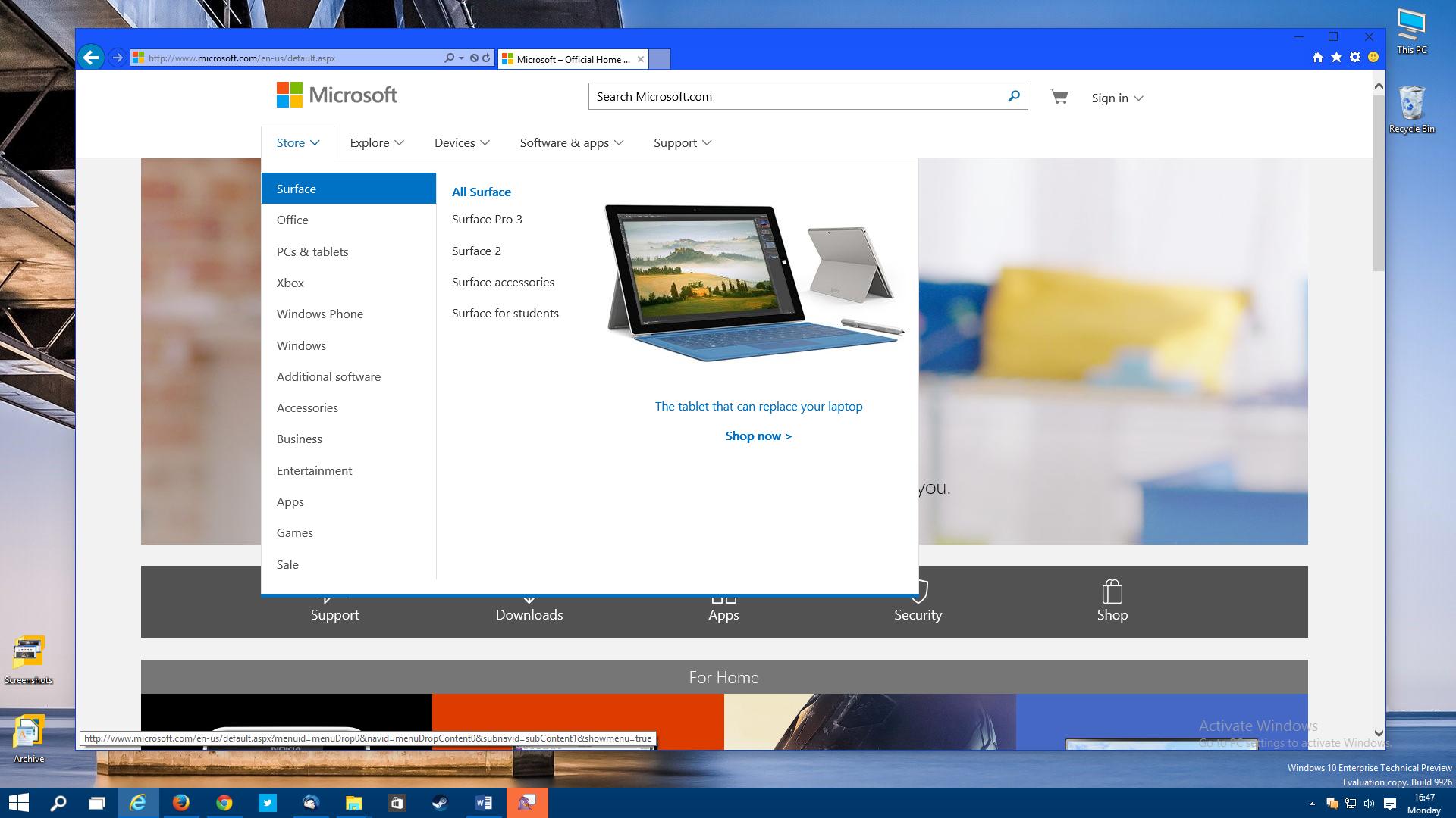
What’s more important is that Microsoft’s new website, which also features tiles, just like modern Windows, is fully responsive, so you can browse it on any device out there, be it a PC, tablet, and smartphone, because it’ll look similar and provide the same navigation options.
Microsoft introduced Windows 8 in October 2012, and soon after that, the company started redesigning its websites and services to embrace the new Metro-based design that’s being used by the operating system.
The same seems to the case right now as well, as Microsoft is gearing up to introduce Windows 10, a brand new operating system that keeps the modern features of Windows 8 but mixes them with classic options previously available in Windows 7.
Microsoft.com is most likely just the first website to be redesign in a longer series of products, so expect similar facelifts to be announced very soon.