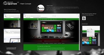
We've already presented you the concept of a talented designer who envisions what the Spartan browser developed by Microsoft could actually look like, and since interest in this kind of work is so high, DeviantArt user seniaku took the project one step further and improved the UI even more.
As you can see in the adjacent photo, the concept indeed looks more refined as compared to the original version, and the imagined version of Spartan now features stylish back and forward buttons, smart tabs, bookmarks, and a new home button design inspired by Windows.
The smart tab concept is indeed interesting and is based on a rather simple idea: whenever you're launching a website considered to be secure, the tab is marked with a green line, while an insecure page is flagged with a red one. This would surely come in handy to those who browse the web all day long, but it clearly needs more improvements to make these warnings a big more visible.
On the other hand, the concept altogether is really pretty, but it's hard to believe that Spartan would actually look like that.
As you’ve most likely heard, Spartan is likely to be Internet Explorer's replacement in Windows, and as compared to the current version of the browser, it could bring a new UI, extensions support, and a new tab bar at the bottom of the screen.
Overall, Spartan could look more like Chrome and Firefox, but nothing is certain until now, so it's really hard to predict when it could arrive and what it might actually look like.

 14 DAY TRIAL //