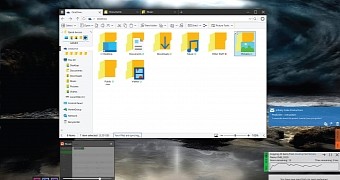
File Explorer is one of the apps that have received only a small number of improvements since the first Windows 10 Technical Preview build came out, despite Microsoft's promises to revamp the file manager as well.
In the meantime, designers across the world use the ideas that some users posted online to create their own interpretations of a new File Explorer, most of which come with pretty much the same features, but obviously with different looks.
This is the case of today's concept that was created by DeviantArt user dAKirby309 and comes with eagerly anticipated features such as tabs for easier file management with more than one folder.
The navigation pane is also touch-friendly, even though that makes little sense on the desktop, while the app menu button adopted the hamburger-like icon that everyone seems to hate these days.
You can also rearrange navigation pane items, which is really great in terms of customization power, and enable or disable some additional items, such as Control Panel, HomeGroup, Network, and Recycle Bin.
Overall, this concept does look good, but a number of visual refinements are still needed, especially because Microsoft wants to make Windows 10 an eye-candy operating system in all respects.
And yet, there's no doubt that Redmond would do itself a favor by checking out these concepts, as they usually highlight very popular ideas coming from the majority of users.

 14 DAY TRIAL //