Microsoft has already started work on Fluent Design, which is the company’s new visual overhaul coming in the Windows 10 Fall Creators Update, but substantial changes are yet to see daylight.
And while the company continues improving Fluent Design behind closed doors, the Windows community knows exactly what the whole thing should look like, with various renders imagining a more substantial facelift of various OS features.
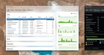
Today, it’s the turn of the Resource Monitor to get Fluent Design treatment, and this concept photo posted on Reddit shows just how good the app could look with a little effort.
The blur effect that Microsoft uses for universal apps is implemented in the Resource Monitor too, along with a new effect that shows up when hovering a menu option. A dark theme is also imagined, and it looks at least as good as the light version.
It goes without saying that this is still in the concept phase and there’s little chance to see this introduced in Windows 10, though we need to wait a few more months to see what Fluent Design actually means for Microsoft.
The first visual refinements are now being rolled out to users in the Windows Insider program, but the full overhaul should see daylight in the fall of this year when the Fall Creators Update goes live for the production ring as well.

 14 DAY TRIAL //