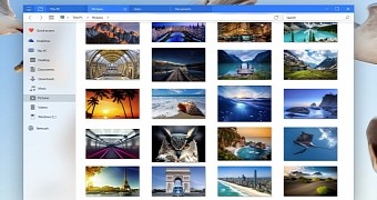
Microsoft is already working on a touch-optimized version of File Explorer that would be offered as a universal app, but until this one arrives, concept designers across the world create mockups that imagine what the new tool should look like.
And judging by where the File Explorer UWP is at this point, it just seems like the majority of concepts look a lot better than the real deal and, even more important, come with highly-requested features like tab support.
This is the case of this rather simple concept that we’ve come across today, published on DeviantArt by user BluPaper. Even though we’ve seen similar mockups in the past, this new concept shows that Microsoft’s File Explorer should have tabs, there’s no doubt about that, especially because the majority of third-party alternatives do come with such a feature.
At the same time, this concept also embraces the already-famous Project NEON visual tweaks for the left sidebar, coming with the transparency and blur effects that are expected to be available across all pre-installed apps with the release of Windows 10 Redstone 3.
It goes without saying that each concept needs usability refinements, and this one makes no exception, though opinions in this direction are in most of the cases subjective. Microsoft would really make itself a favor by checking out these mockups, so fingers crossed for tab support in File Explorer.

 14 DAY TRIAL //